Svelte
CSS
Purpose
Almost everyone has been stuck in a indecisive dead lock when given options about what to eat. This application was meant to visually demonstrate the options people had and duke it out in a Tinder-like deciding battle.
Lore
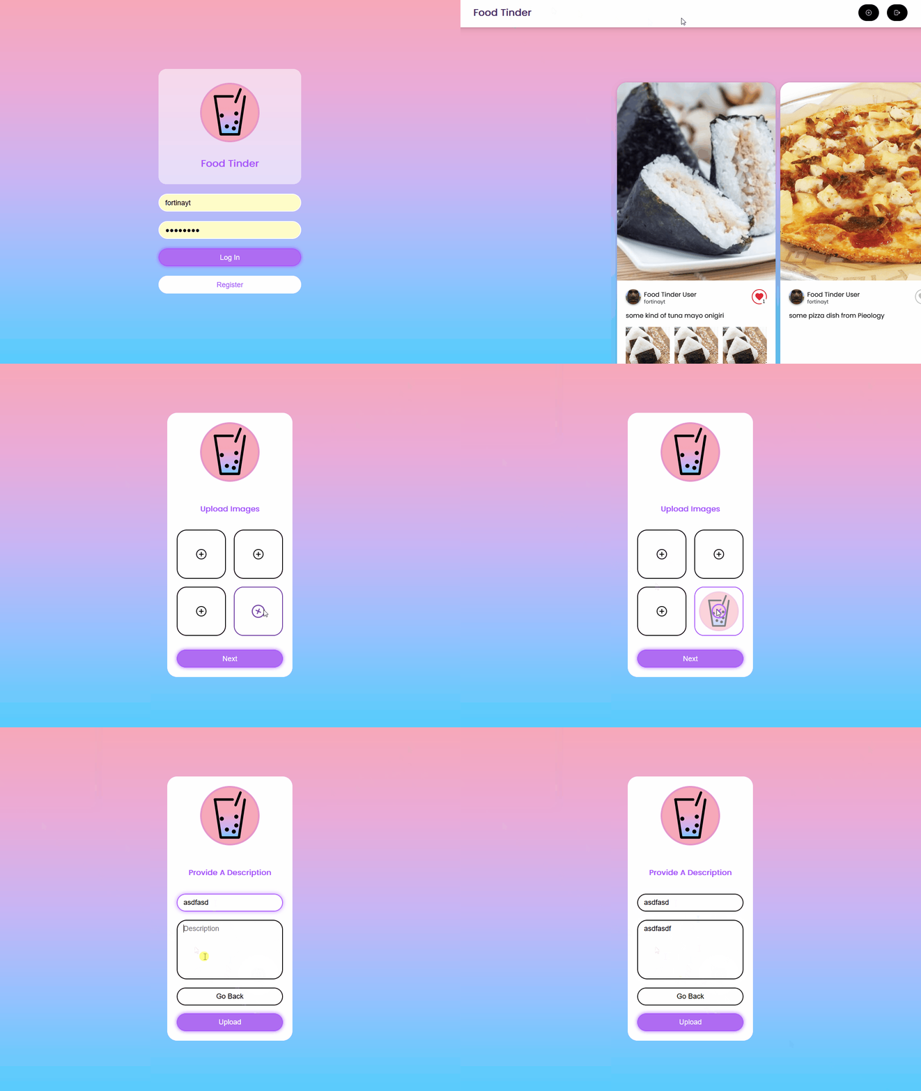
Food Tinder was a very ambitious idea I came up with at the time having no real web-app development experience. I assisted in developing this project during a club meeting for the largest computer science club in CSUF, ACM. A constraint we had was that this project had to be finished in a semester long period. With that out the way I managed to contribute by created the “create post” page, nav bar, and assist in the login page UI.
Challenges
This is the first real time I touched a front-end framework and actually built something that looks modestly nice. But it was definitely a learning curve at the time since I did not really understand JavaScript too well which caused some struggle. Overall, with the help of my group and the Svelte Docs I think that Food Tinder definitely looks great.
Fun Fact
The little logo that is shown in Food Tinder is none other than Boba Bob, a mascot I made in an hour using Figma.